Colours can have a profound impact on human behaviour. Some responses may originate from learned behaviours, like stopping at a red light. Others rise from emotions, like the experience of feeling relaxed while sitting in a park surrounded by green trees, grass, and plants. The idea of colours as influential stimuli has a deep connection with psychological and personal experiences, far too complex to discuss here, but because of this connection, colour patterns are an integral part of shaping the intricate tapestry of how humans perceive and interact with the world. When it comes to marketing strategies, marketers need to understand the meaning and effect of the colours employed in their advertising campaigns, so they can better control and invoke the desired emotions in their consumer base.
In other words, companies deliberately choose the colours employed in their marketing strategies with the purpose of relating to their customers on both a conscious and subconscious level. They want specific emotions to be associated with their brand, as those emotions could lead to enough enthusiasm for the product that customers will make a purchase. It is also important that marketing professionals have this keen awareness when conveying a product’s inherent traits. Selecting the right shades or patterns extend beyond mere aesthetics. They are a critical factor in influencing customer decisions.

For instance, Valentine’s Day is just around the corner. Many companies and retail outlets will have a variety of products or product displays designed to capitalize on this special occasion. One of the ways they will attempt to influence customers to make a Valentine’s Day purchase is with specific hues commonly associated with love, romance, friendship, and relationship growth. These hues could be used to colour the products themselves or the product packaging. Either way, the nuance of such choices is meant to coincide with the theme of the occasion, as well as align with the human emotion being expressed among couples and young lovers across North American society.
Even within Valentine’s Day itself, colours can vary depending on the type of affection that a company may want to promote. Red is a warm, intense colour, which is often used to highlight feelings of passion and intensity. Brands aiming to sell products designed for married or committed couples may employ lots of red shades in their palette. Shades of pink and purple are more light-hearted and playful, and thus, companies marketing their products to teens or younger people could use these colours to attract those who are in the early stages of a connection. Greens could be used to market products to couples who enjoy a more subtle, sustainable representation of their relationship. Shades of turquoise, aqua, or blue give off cooler, less intense vibes, and could be used for products that are geared towards friends or family members.
The allure of certain brands over others could very well have root in the strategic use of colours in their marketing. Customer loyalty stems mostly from quality products marketed well via sale outlets that excel at service. But if companies were to provide equally strong product experiences, the question remains how customers unfamiliar with the options presented to them would respond. What would make them trust one product over the other? The answers could be various for many different reasons. The intense green used by Starbucks in their logo as well as throughout their packaging conveys a certain prestige to the product. Sustainable, quality coffee that is purchased and roasted ethically. The customer loyalty that Starbucks has been able to attain is unprecedented. Tim Hortons, on the other hand, uses for its logo and coffee packaging a combination of red and white. Red in this case could reference speed or discount, which would appeal to customers looking for a cheaper, quicker alternative to Starbucks. The red and white combination could also highlight the company’s Canadian roots, which has been highlighted not only in the company’s marketing, but in the loyal relationship Tim Hortons has fostered with Canadians across the country and beyond. Thus, colour and market messaging have a close-knit relationship.
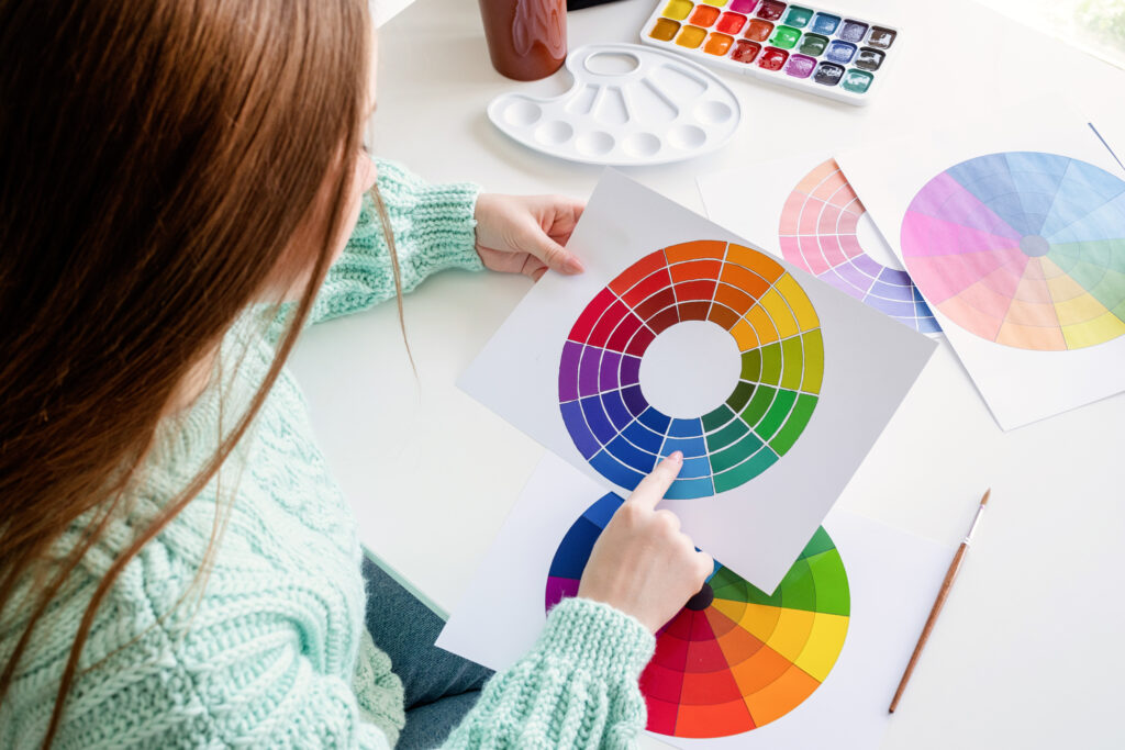
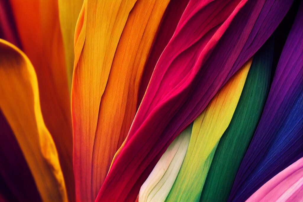
To gain a better understanding of colours and how to use them, basic knowledge of the colour wheel would be a great starting point. Each segment of the wheel evokes distinct emotions. They can be divided into three categories: warm, cool, and neutral:
Warm Colours: Red, Yellow, Orange, Pink. These tones give off feelings of warmth, positivity, and passion. They could be associated with a more fiery intensity.
Cool Colours: Purple, Blue, Green. These hues are often found in nature, associated with water, plants, and earthly substances. They could be associated with calm, comfort, as well as an association with the environment.
Neutral Colours: White. Black. Grey, Brown. While many of these colours aren’t found on the colour wheel, they are composed of multiple colours. These hues are versatile. They can combine with other colours to enhance or compliment a tone. They can also stand alone to embody strength, richness, peace, or purity.
Just as colours can be used to create positive responses, incorrect use can also lead to more negative responses. A luxury brand using shades of red and yellow could be diluting the appeal of their products as they inadvertently give off vibes of a discounted product meant for impulse buying. A combination of cool colours with warm colours could give off a similar vibe. A discount grocery store like Food Basics combines green with yellow, while their upscale Metro store employs multiple shades of dark red, gray, and brown. The atmosphere of a retail environment is often set by the colour patterns used, not just because of the emotional tone they influence in human beings, but also in the type of purchasing occurring within the space. Luxurious tones put people in the mood to spend more money, while certain tones could influence customers to be more budget-conscious.

Brands understand how tones and patterns work through a variety of quantitative and qualitative market research insights. A study done by Insights In Marketing reported that 93% of consumers view the visual appearance of a product as the most important factor in making a purchase. Similarly, 85% of consumers report that they were influenced to purchase by the colour of a product. To gauge how colour impacts consumer buying patterns, businesses could utilize surveys to see how everyday people feel about certain colours or combinations. In a more technologically advanced environment, certain biometric sensors or facial technology can provide insight into how people engage with colours via responses like pulse rate, expression, and SCR (skin conductance response). Responses from open-ended questioning can be categorized and analyzed to leverage important insights into the use of colour in brand valuation, design, and advertising. Comparative data can then be used to better integrate precise colour usage into a brand’s marketing strategy.
Establishing a distinct and recognizable brand identity that is reflected back in how customers interact with the designed products or services is how to differentiate from competitors. Thus, it is important to be aware of how colour could affect not only aesthetics, but the functionality, quality, and overall customer interest in frequently using a product. It is very much the reason why McDonald’s uses a powerful yellow for their golden arches logo to represent reliability and fast, but an intense brown for their McCafe brand, meant to invoke the hues of a fresh cup of coffee. The complimentary blue and yellow of Royal Bank’s logo establishes trust with the customer that their money is reliably safe, while the subdued grays and whites of Apple suggest exclusive tech sophistication. The visual appearance, which combines colour with pre-determined fonts and shapes, has tremendous sway in consumer decision-making.

Colours have the ability to shape customer perceptions and choices. Whether it be due to learned societal norms or deep-seated psychological connections, the conscious selection and use of specific hues and tones by brands in their marketing strategies can have powerful impacts. A thorough understanding of how color influences consumer behavior requires delving into the motivations and preferences that drive decision-making. Research is important to have more reliable data sets to use as reference. It is also important to understand the emotional effects that colours will emanate to attract the right customer to the right product at the right time. This approach enables brands to go deeper into their consumer behaviour while understanding that visual elements can be powerful and often subconscious influencers of human behavior.
Next time you find yourself out and about in a store, take a moment to look at the vast amount of colour around you. Consider how each product’s use of colour makes you feel, comparing like products to see if you feel drawn to one in particular. This exercise could reveal unexpected insights to your decision-making process, as well as how conscious a company was in selecting their hues and shades beyond mere visual aesthetic.